
Photo by Mike Dorner on Unsplash
In a recent project I built from scratch, I was intrigued by the idea of experimenting with chunking my app to optimize its performance when deployed on the blockchain. One of my primary goals was to minimize the number of CSS files included in the project. As I explored this further, I had the idea of using components with a class-based approach similar to Tailwind CSS. However, I steered clear of relying on any external frameworks, as I’ve always been cautious about adding unnecessary dependencies if they aren’t required. I also believed that this experiment could provide greater flexibility in the long run.
In a nutshell, I ended up creating a Sass mixin for building my own class-based framework. In this blog post, I’m excited to share it with you.
The project we built together with my colleagues is called Oisy. It’s an open-source Ethereum wallet hosted on the Internet Computer.
Overview
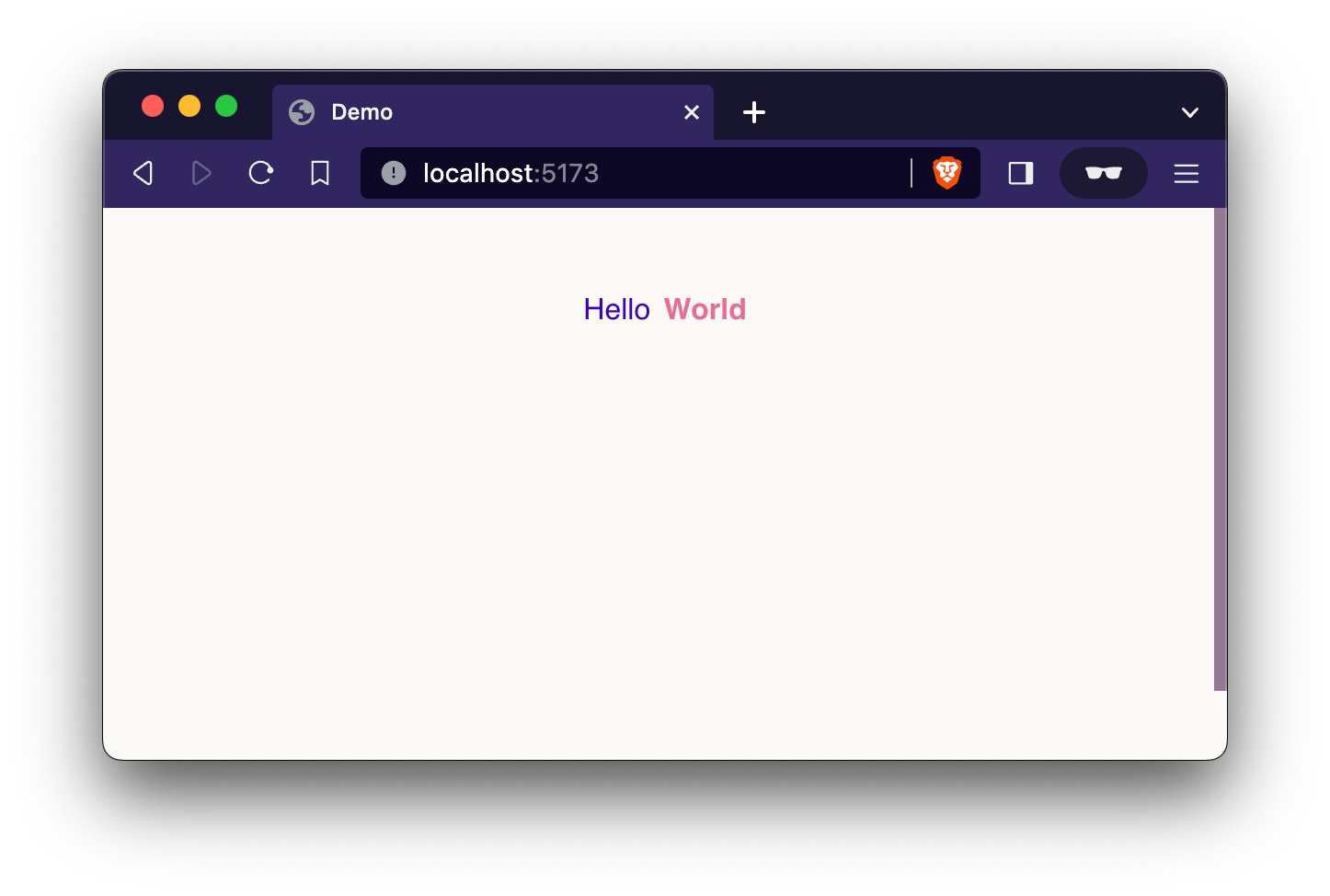
The idea behind the mixin is to eliminate code duplication while enabling the generation of classes that can be used to create responsive components. For instance, consider the following code snippet:
<div class="flex justify-center gap-1 mt-4">
    <span class="text-blue">Hello</span>
    <span class="text-cyclamen font-bold">World</span>
</div>
This code would render a web page featuring a div container with a centered flex layout and a top margin. Inside this container, there are two inline span elements, each assigned specific colors, with one of them set to bold text.
While I could have simply declared these classes globally, my objective was to generate them using a Sass utility for all my styling needs.
Gotcha
This solution exceeded my expectation when I first began to code it but, it’s essential to note that it’s not as advanced as dedicated CSS frameworks like Tailwind. Before we proceed further, it’s important to be aware of the following two limitations:
Responsivity in this solution is limited to the usage one breakpoint. Throughout the development of the application, UI rules consistently relied on a single breakpoint. However, there were instances when experimenting with multiple breakpoints, the visual outcomes didn’t always align with expectations. If your requirements involve multiple breakpoints, the mixin may require improvements in terms of selectors to accommodate these scenarios.
It’s common for CSS frameworks to include a
postCssjob that handles the task of cleaning up your bundle by removing any unused styles after compilation. However, I do not provide such a hook here.
Media Queries
While not strictly necessary for the implementation of this solution, I leveraged another mixin we use across all our applications. Within a _media.scss mixin file, I incorporated the following code to ease the utilization of breakpoint rules before effectively implementing the core of this tutorial:
$breakpoint-xsmall: 320px;
$breakpoint-small: 576px;
$breakpoint-medium: 768px;
$breakpoint-large: 1024px;
$breakpoint-extra-large: 1300px;

@mixin min-width($breakpoint) {
    @if ($breakpoint == xsmall) {
        @media (min-width: $breakpoint-xsmall) {
            @content;
        }
    } @else if ($breakpoint == small) {
        @media (min-width: $breakpoint-small) {
            @content;
        }
    } @else if ($breakpoint == medium) {
        @media (min-width: $breakpoint-medium) {
            @content;
        }
    } @else if ($breakpoint == large) {
        @media (min-width: $breakpoint-large) {
            @content;
        }
    } @else if ($breakpoint == xlarge) {
        @media (min-width: $breakpoint-extra-large) {
            @content;
        }
    } @else {
        @error "UNKNOWN MEDIA BREAKPOINT #{$breakpoint}";
    }
}

@mixin light-theme() {
    :global(html[theme="light"]) {
        @content;
    }
}

@mixin dark-theme() {
    :global(html[theme="dark"]) {
        @content;
    }
}
As I’ve already shared and explained the snippet above in a previous blog post, I won’t go into extensive detail here. If you’re interested in learning more, please refer to my article titled “Sass Media Queries Mixins”.
Class Generator
Finally, we’ve reached the heart of our solution. To produce the responsive classes we’ve discussed, I’ve created the following Sass mixin in a file I’ve named _utilities.scss:
@use "media";

@mixin generate($selector, $property, $value) {
    .xs\:#{$selector} {
        @include media.min-width(xsmall) {
            #{$property}: $value;
        }
    }

    .sm\:#{$selector},
    .sm\:#{$selector}[class*="-"],
    .sm\:#{$selector}[class*="xs\:"] {
        @include media.min-width(small) {
            #{$property}: $value;
        }
    }

    .md\:#{$selector},
    .md\:#{$selector}[class*="-"],
    .md\:#{$selector}[class*="xs\:"],
    .md\:#{$selector}[class*="sm\:"] {
        @include media.min-width(medium) {
            #{$property}: $value;
        }
    }

    .lg\:#{$selector},
    .lg\:#{$selector}[class*="-"],
    .lg\:#{$selector}[class*="xs\:"],
    .lg\:#{$selector}[class*="sm\:"],
    .lg\:#{$selector}[class*="md\:"] {
        @include media.min-width(large) {
            #{$property}: $value;
        }
    }

    .xl\:#{$selector},
    .xl\:#{$selector}[class*="-"],
    .xl\:#{$selector}[class*="xs\:"],
    .xl\:#{$selector}[class*="sm\:"],
    .xl\:#{$selector}[class*="md\:"],
    .xl\:#{$selector}[class*="lg\:"] {
        @include media.min-width(xlarge) {
            #{$property}: $value;
        }
    }

    .#{$selector} {
        #{$property}: $value;
    }
}
This utility accepts three parameters:
$selector: The classname which can ultimately be used in the components.$property: The CSS property that needs to be set, such asdisplayorfont-weight.$value: The expected value of the style, for example,blockor700in the previous examples.
For each combination of parameters, the mixin generates CSS classes defined globally, including their corresponding responsive representations. These classes are meticulously organized in a specific order, beginning with the smallest media query and concluding with the wider ones, all followed by the global value.
For example, when using the generator with a selector called block and specifying display as the property and block as the value, it results in the following generated code:
/**
 * Example of output; do not copy this in your app.
 */

@media (min-width: 320px) {
    .xs\:block {
        display: block;
    }
}

@media (min-width: 576px) {
    .sm\:block,
    .sm\:block[class*="-"],
    .sm\:block[class*="xs:"] {
        display: block;
    }
}

@media (min-width: 768px) {
    .md\:block,
    .md\:block[class*="-"],
    .md\:block[class*="xs:"],
    .md\:block[class*="sm:"] {
        display: block;
    }
}

@media (min-width: 1024px) {
    .lg\:block,
    .lb\:block[class*="-"],
    .lg\:block[class*="xs:"],
    .lg\:block[class*="sm:"],
    .lg\:block[class*="md:"] {
        display: block;
    }
}

@media (min-width: 1300px) {
    .xl\:block,
    .xl\:block[class*="-"],
    .xl\:block[class*="xs:"],
    .xl\:block[class*="sm:"],
    .xl\:block[class*="md:"],
    .xl\:block[class*="lg:"] {
        display: block;
    }
}

.block {
    display: block;
}
Usage
The generator mixin handles the task of class generation, but it doesn’t have knowledge of which classes need to be generated. Therefore, when integrating this solution, developers are still responsible for declaring the specific classes they intend to use in their application.
I’ve found it beneficial to separate different styles into dedicated Sass files, such as creating a dedicated Sass file for each style topic.
To demonstrate this usage, I’ll share the classes I’ve declared, which are utilized in the code snippet showcased in the first chapter of this tutorial.
display.scss :
@use "../mixins/utilities";

$property: display;

@include utilities.generate(hidden, $property, none);
@include utilities.generate(block, $property, block);
@include utilities.generate(flex, $property, flex);
justify-content.scss :
@use "../mixins/utilities";

$property: justify-content;

@include utilities.generate(justify-start, $property, flex-start);
@include utilities.generate(justify-end, $property, flex-end);
@include utilities.generate(justify-center, $property, center);
@include utilities.generate(justify-between, $property, space-between);
gap.scss :
@use "../mixins/utilities";

$property: gap;

@include utilities.generate(gap-1, $property, var(--padding));
@include utilities.generate(gap-2, #{$property}, var(--padding-2x));
@include utilities.generate(gap-4, #{$property}, var(--padding-4x));
Note that in the application, I make use of global CSS variables, such as --padding set to 8px.
margin.scss :
@use "../mixins/utilities";

$property: margin;

@include utilities.generate(m-0, $property, 0);
@include utilities.generate(mx-0, #{$property}-left, 0);
@include utilities.generate(mx-0, #{$property}-right, 0);
@include utilities.generate(ml-0, #{$property}-left, 0);
@include utilities.generate(mr-0, #{$property}-right, 0);
@include utilities.generate(my-0, #{$property}-top, 0);
@include utilities.generate(my-0, #{$property}-bottom, 0);
@include utilities.generate(mt-0, #{$property}-top, 0);
@include utilities.generate(mb-0, #{$property}-bottom, 0);

@include utilities.generate(m-1, $property, var(--padding));
@include utilities.generate(mx-1, #{$property}-left, var(--padding));
@include utilities.generate(mx-1, #{$property}-right, var(--padding));
@include utilities.generate(ml-1, #{$property}-left, var(--padding));
@include utilities.generate(mr-1, #{$property}-right, var(--padding));
@include utilities.generate(my-1, #{$property}-top, var(--padding));
@include utilities.generate(my-1, #{$property}-bottom, var(--padding));
@include utilities.generate(mt-1, #{$property}-top, var(--padding));
@include utilities.generate(mb-1, #{$property}-bottom, var(--padding));

@include utilities.generate(m-2, $property, var(--padding-2x));
@include utilities.generate(mx-2, #{$property}-left, var(--padding-2x));
@include utilities.generate(mx-2, #{$property}-right, var(--padding-2x));
@include utilities.generate(ml-2, #{$property}-left, var(--padding-2x));
@include utilities.generate(mr-2, #{$property}-right, var(--padding-2x));
@include utilities.generate(my-2, #{$property}-top, var(--padding-2x));
@include utilities.generate(my-2, #{$property}-bottom, var(--padding-2x));
@include utilities.generate(mt-2, #{$property}-top, var(--padding-2x));
@include utilities.generate(mb-2, #{$property}-bottom, var(--padding-2x));

@include utilities.generate(m-4, $property, var(--padding-4x));
@include utilities.generate(mx-4, #{$property}-left, var(--padding-4x));
@include utilities.generate(mx-4, #{$property}-right, var(--padding-4x));
@include utilities.generate(ml-4, #{$property}-left, var(--padding-4x));
@include utilities.generate(mr-4, #{$property}-right, var(--padding-4x));
@include utilities.generate(my-4, #{$property}-top, var(--padding-4x));
@include utilities.generate(my-4, #{$property}-bottom, var(--padding-4x));
@include utilities.generate(mt-4, #{$property}-top, var(--padding-4x));
@include utilities.generate(mb-4, #{$property}-bottom, var(--padding-4x));
color.scss :
@use "../mixins/utilities";

$property: color;

@include utilities.generate(text-blue, $property, #3b00b9);
@include utilities.generate(text-cyclamen, $property, #ea6c99);
font-weight.scss :
@use "../mixins/utilities";

$property: font-weight;

@include utilities.generate(font-normal, $property, 400);
@include utilities.generate(font-bold, $property, 700);
As you can see, it’s quite straightforward to generate these class helpers using the mixin we’ve created above. This approach not only simplifies class declarations but also reduces them to just a few lines of code.
For more examples of usage, you can explore the Oisy’s repository.
Conclusion
In closing, we’ve explored the creation of a dynamic and responsive class generation solution using Sass mixins. This approach has fulfilled my initial intent and exploration. While I may not be certain about reusing it in upcoming projects, there are certainly several valuable concepts within it that I believe are worth revisiting in the future.
I must admit, as a developer who generally isn’t particularly fond of CSS class-based approaches, I not only enjoyed developing it but have also found a certain affinity for using it.
David