Photo by Ravi Sharma on Unsplash
We recently added App Shortcuts and maskable icons to DeckDeckGo. While I was reading tutorials to implement these features, I came across some questions regarding design such as:
- What’s the size of the safe area?
- Should the shortcuts’ icons colors be contrasting?
- Shortcuts icons are maskable icons or regular ones?
- Can both maskable and regular icons find place together?
While I would have probably be able to solve these questions by my self, by reading more carefully the related blog posts or documentations, I had instead the idea, that I can do what also works well in such a situation: do the "copycat" 😅.
Twitter, which I am using on a daily basis, is a great example of Progressive Web Apps. Moreover, I am guessing that they have some budget to invest in UX and design development. Therefore, why not using their best practice to unleash our features instead of reinventing the wheels.
Thank you Twitter 🙏
Sneak Peek
In this post I share the answers and resources we used to add App Shortcuts and maskable icons to our editor for presentations.
App Shortcuts
App Shortcuts are now supported by Chrome version 84 and Microsoft Edge.
Moreover, Progressive Web Apps available in Google Play do also support shortcuts. We are using the PWA builder to convert our PWA to the store’s requested TWA format. They recently upgraded their tool to also automatically supports these links, so once again, thank your PWA builder team for the improvements 👍.
Between all tutorials, the one of web.dev is a great resource to get started. It describes which options can or should be provided to add such shortcuts to a web app.
Summarized, it works with a lit of shortcuts which can be added to the web app manifest . For example, we can create two shortcuts as following:
{
  "name": "Player FM",
  "start_url": "https://player.fm?utm_source=homescreen",
  …
  "shortcuts": [
    {
      "name": "Open Play Later",
      "short_name": "Play Later",
      "description": "View the list of podcasts",
      "url": "/play-later?utm_source=homescreen",
      "icons": [{ "src": "/icons/play.png", "sizes": "192x192" }]
    },
    {
      "name": "View Subscriptions",
      "short_name": "Subscriptions",
      "description": "View the list of podcasts you listen to",
      "url": "/subscriptions?utm_source=homescreen",
      "icons": [{ "src": "/icons/subs.png", "sizes": "192x192" }]
    }
  ]
}
Moreover than the technical questions, I was asking my self which colors are the most suited for these icons? Our logo being blue, should I also provide blue icons? Or should I use contrasting colors? Or other colors taken from our palette and identity?
That’s where Twitter came to the rescue for first time 😉.
I began by having a look at the HTML source of Twitter to find out the url of their web app manifest .
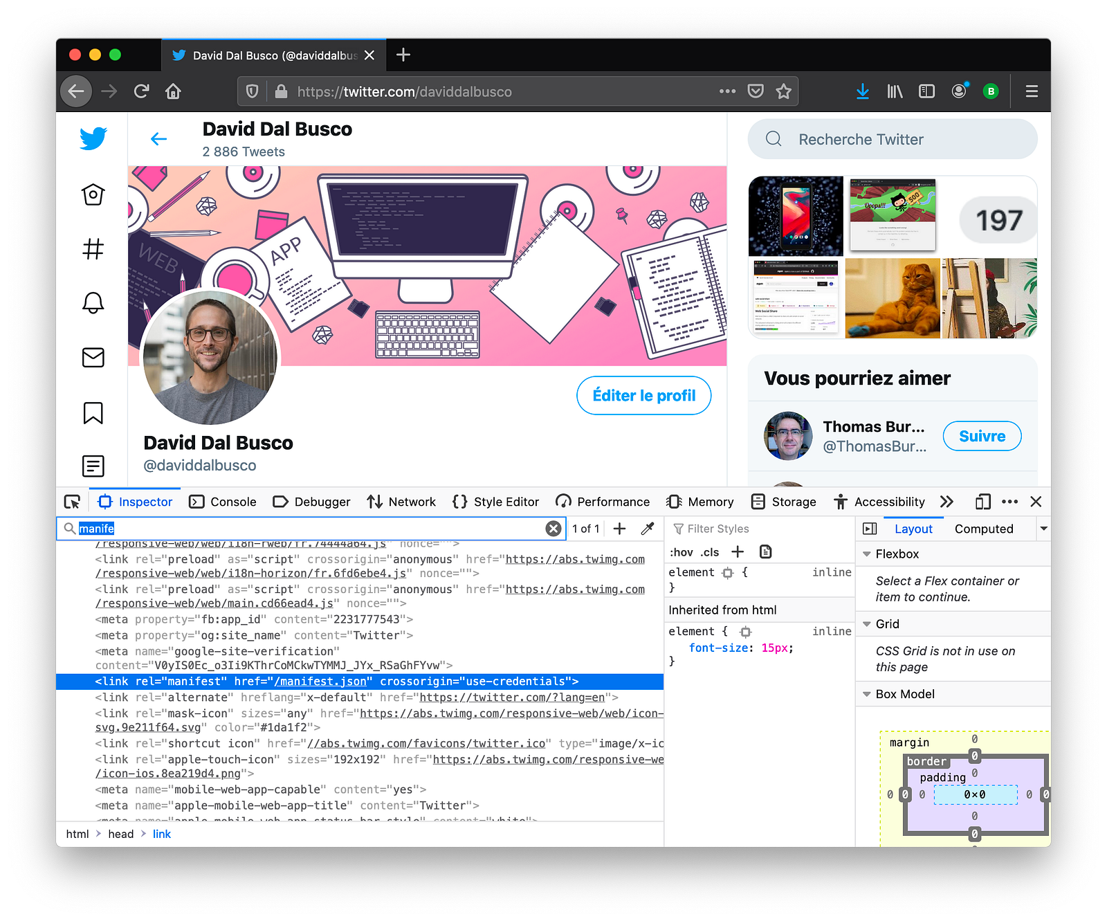
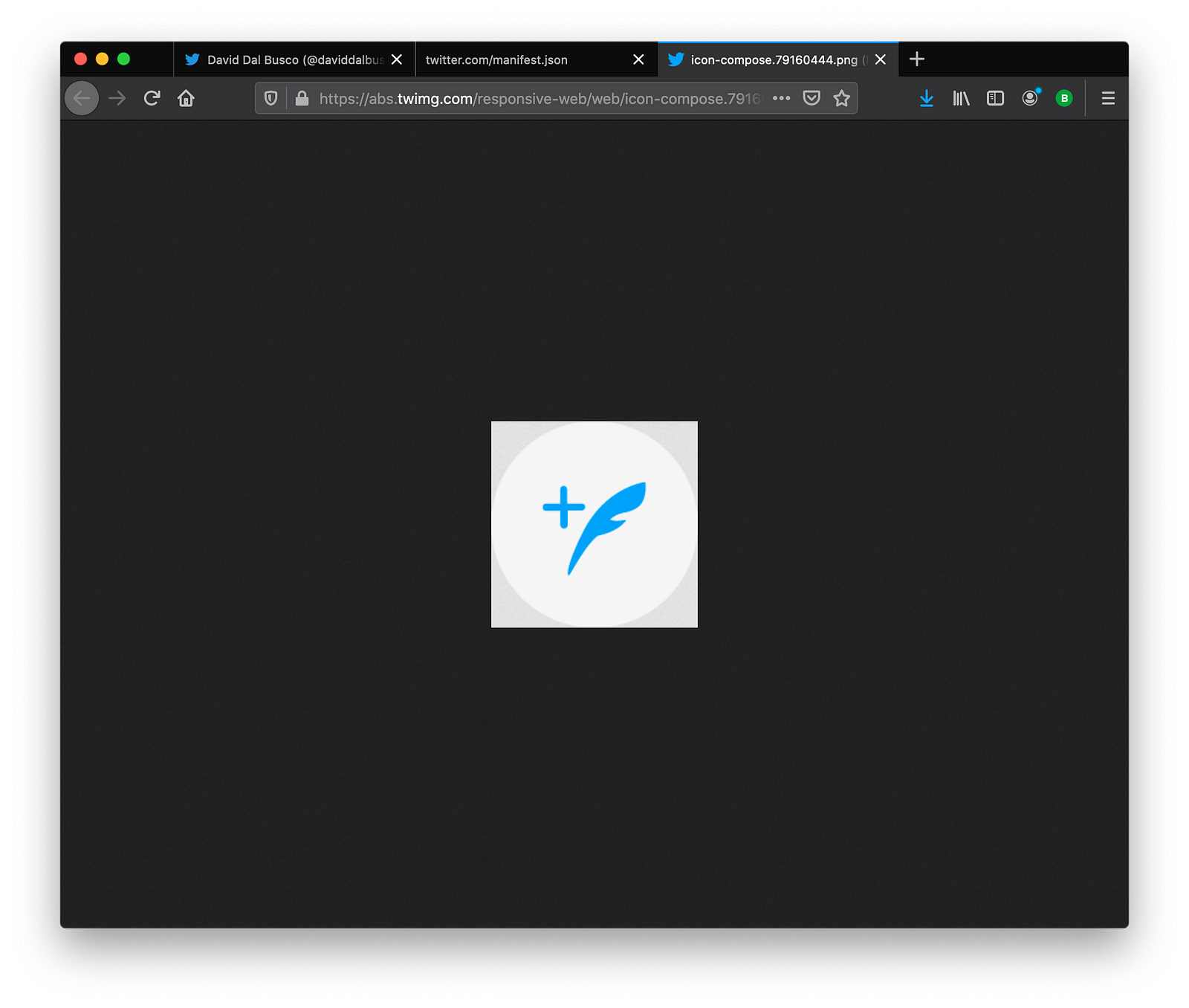
Once found, I opened the manifest file and had a look at their shortcuts section. They are providing four shortcuts (“New Tweet”, “Explore”, “Notifications” and “Direct Messages”).
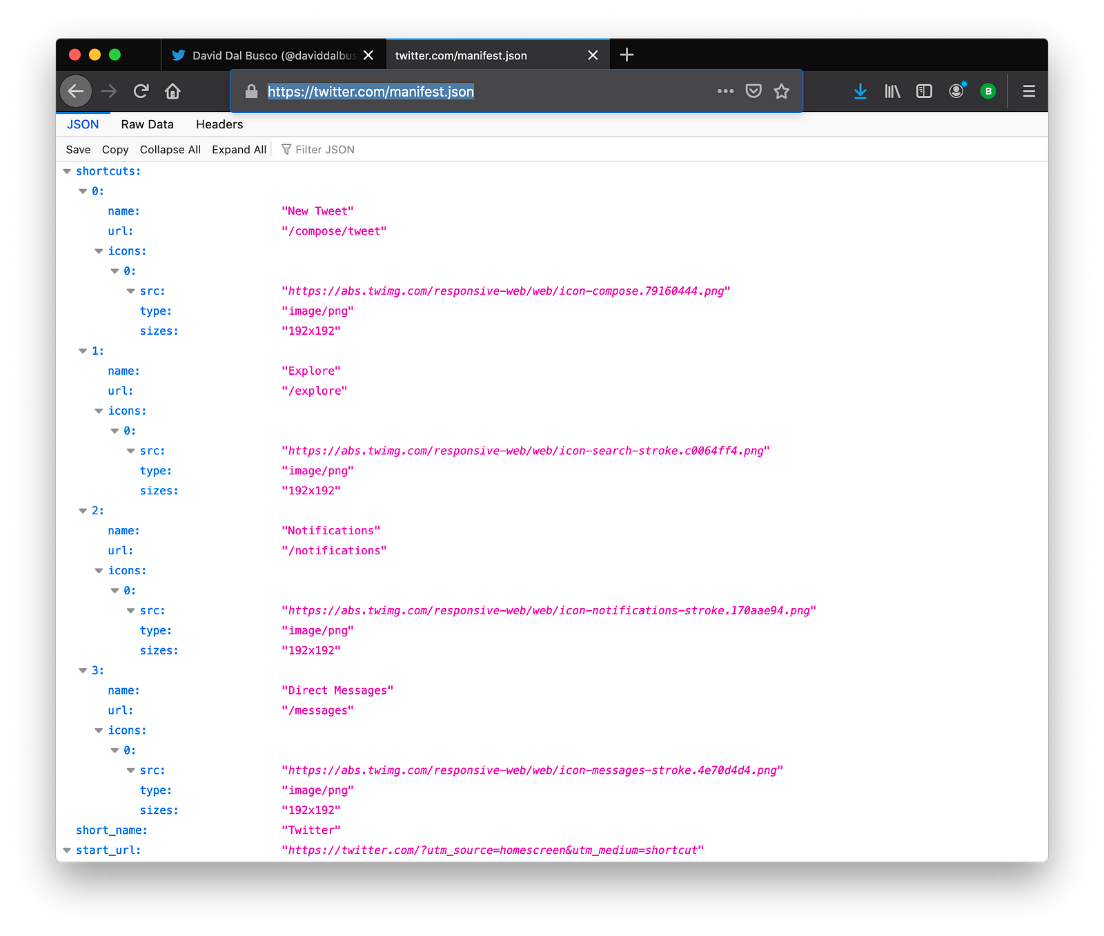
Finally, I opened these icons to answer my question: yes, they don’t use their primary color as background for the shortcut’s icons but rather use a contrasting color and the primary as color of the symbol. I also noticed that the contrasting color was not white but rather a light grey (#F5F5F5).
Furthermore, it also answered another question I was asking my self: no, shortcuts icons are not maskable, these are regular icons and therefore, can be round.
As I was about to finalize my icons with these colors, a new question bumped into my mind: what about the safe area?
To solve this new question, I downloaded the Twitter shortcut icon, imported it in my design tool (Affinity Designer) and resized mine as it matched the same size. Told you, why reinventing the wheels 🤷.
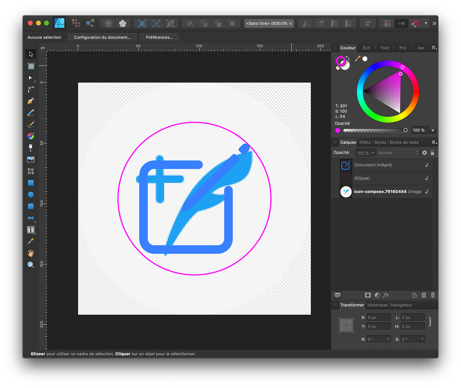
That was it. My icons were ready to be added as shortcuts.
Summary
Not a summary of what are App Shortcuts but a summary of what Twitter does regarding my related questions:
- Use a contrasting color for the background of the shortcuts icons and use your
primary color for the symbol. - For these background, a light grey color (#F5F5F5) can be used.
- The shortcuts’ icons are regular icons. 192x192 PNG. They can be round.
Maskable Icons
Maskable is an icon format to use adaptive icons on supporting platforms. In other terms: provide an icon to your Progressive Web Apps which can be either displayed in a circle, rounded rectangle, square, drop or cylinder according the device expectations.
The web.dev team provided again a handy tutorial about the subject and even linked some nice tools, such as Maskable.app, which help create such icons.
While I was developing these for our editor, even though everything seemed clear at first, I was not sure at some point if only maskable icons had to be provided or if I had to provide regular icons too? If both can be provided, how exactly the purpose field of the web app manifest had to be specified?
I notably was unsure about the best way to approach this because when I ran the first test, I noticed that Chrome was displaying in its tab bar our super cool logo as a square which to my eyes, wasn’t that cute anymore in comparison to a circle or as previously, our shiny bubble.
Once again, Twitter come to the rescue. I checked their manifest and noticed that indeed they are providing four icons.
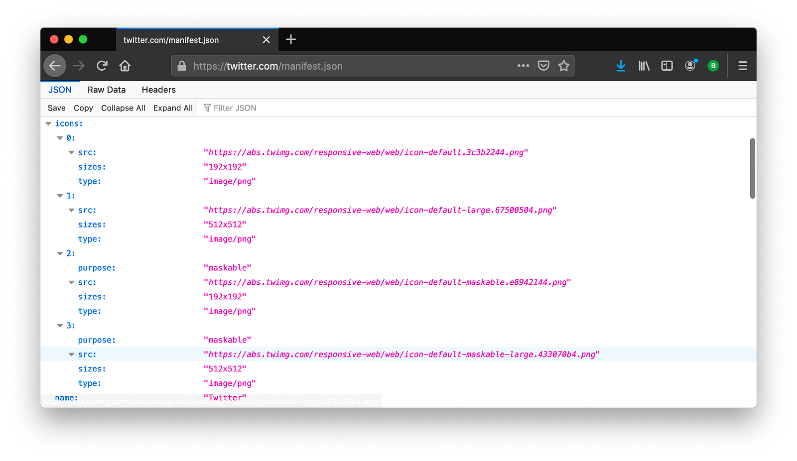
I noticed that they are providing two pairs of icons, the regular and maskable one, both with two sizes, 192x192 and 512x512, and more important, that they are providing the field purpose only for the maskable one.
I set our definition the same way. I was happy to notice that maskable icons were still use on my Android phone and that our sweet logo was back in the form I wanted in the Chrome tab bar 🥳.
Summary
Not a summary of how to apply and create maskable icons but a summary of what Twitter does regarding my related questions:
- Yes, both regular and maskable icons can be provided.
- If so, the field
purposeof theiconsin theweb app manifestshould be only specified for the maskable ones, respectively the regular ones don’t have to have apurpose.
Altogether
Because we are open source, let me point out the fact that you can find these related icons in our repo and our following web app manifest as well.
{
    "name": "DeckDeckGo",
    "short_name": "DeckDeckGo",
    "display": "standalone",
    "theme_color": "#ffffff",
    "background_color": "#3a81fe",
    "scope": "/",
    "start_url": "/",
    "orientation": "portrait",
    "icons": [
        {
            "src": "/assets/favicon/icon-default-192x192.png",
            "sizes": "192x192",
            "type": "image/png"
        },
        {
            "src": "/assets/favicon/icon-default-512x512.png",
            "sizes": "512x512",
            "type": "image/png"
        },
        {
            "purpose": "maskable",
            "src": "/assets/favicon/android-chrome-192x192.png",
            "sizes": "192x192",
            "type": "image/png"
        },
        {
            "purpose": "maskable",
            "src": "/assets/favicon/android-chrome-512x512.png",
            "sizes": "512x512",
            "type": "image/png"
        }
    ],
    "shortcuts": [
        {
            "name": "Write a presentation",
            "short_name": "Write a presentation",
            "description": "Start writing a new presentation",
            "url": "/editor",
            "icons": [{ "src": "/assets/favicon/shortcut-editor-192x192.png", "sizes": "192x192" }]
        },
        {
            "name": "Dashboard",
            "short_name": "Dashboard",
            "description": "Access your dashboard",
            "url": "/dashboard",
            "icons": [{ "src": "/assets/favicon/shortcut-dashboard-192x192.png", "sizes": "192x192" }]
        }
    ]
}
Summary
Beside hoping that this blog post will be useful to someone, someday, I hope that it also transmit the idea that approaching design and UX questions is also having a look at what other do.
I was asked a couple of times by other developers how I design apps, even though I am not a designer, don’t feel like one and probably never gonna be one.
My answer is always them same: I kind of see my self as a “copycat”. I find things I like, I try my best to develop by myself something “a-ok” inspired from these.
Having a dope designer in a team is definitely an asset but if unfortunately you cannot have one, such approach might help I hope. Inspiration is somehow an essential part of the creation no?
To infinity and beyond!
David