This weekend, I started creating a showcase of all dapps built with Juno for our website, which uses Docusaurus. Since I found the documentation somewhat lacking, I’ve decided to share a tutorial outlining the steps involved.
Note: All the code discussed in this blog post is open source and available for you to view and use. You can find it in my repository here.
UI: Page
If your primary interest is in data loading, this step might be optional. However, for building a feature like a “showcase,” it’s helpful to start with creating a new route. For my project, where I wanted to present the page at a /showcase path, I initated a new component in src/pages/showcase/index.tsx, using TypeScript/TSX.
The layout of this page is simple. It’s composed of two sections: the first serves as an introduction and includes an invitation for submissions of dapps to be featured in the showcase. The second section is where the spotlighted applications will be displayed.
Remember, at this point, the component doesn’t contain any data. It’s essentially a skeleton that we’ll populate with data in the following chapters.
import Link from "@docusaurus/Link";
import Spotlight from "@site/src/components/Spotlight";
import Layout from "@theme/Layout";
import styles from "./index.module.scss";
export default function Showcase() {
// TODO: the data we want to display
const dapps = [];
return (
<Layout>
<section>
<h1>Showcase</h1>
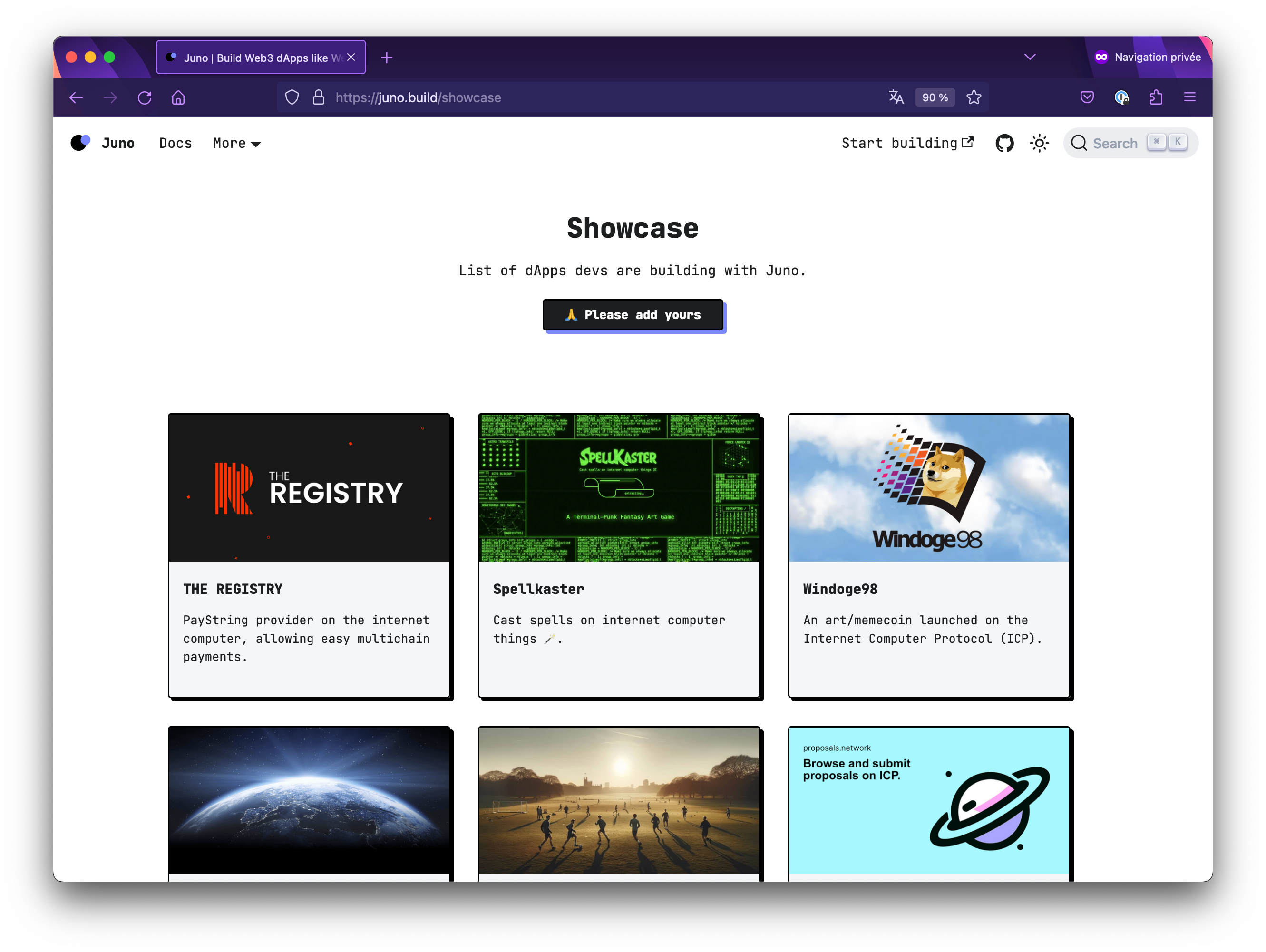
<p>List of dApps devs are building with Juno.</p>
<Link href="https://github.com/junobuild/docs#submit-your-work" target="_blank">
🙏 Please add yours
</Link>
</section>
<section>
<div className={styles.grid}>
{dapps.map((data, i) => (
<Spotlight {...data} key={i} />
))}
</div>
</section>
</Layout>
);
}The snippet shared earlier focuses on the HTML structure and doesn’t include styling details. For those interested in the visual layout of the cards that we will populate, here’s a quick overview of the CSS. It’s designed to display a grid layout on wider devices and switch to a flex column layout on mobile devices.
.grid {
    display: flex;
    flex-direction: column;

    --grid-gap: 2rem;
    gap: var(--grid-gap);

    @media screen and (min-width: 768px) {
        display: grid;
        grid-template-columns: repeat(2, calc((100% - (1 * var(--grid-gap))) / 2));
    }

    @media screen and (min-width: 996px) {
        grid-template-columns: repeat(3, calc((100% - (3 * var(--grid-gap))) / 3));
    }
}
UI: Component
In this chapter, we’re going to look at the component that displays the dapps developers have built. The showcase page is set up to list these projects. To handle this, I needed a specific component.
Given that the project is built with TypeScript, I created an interface to define the metadata for the dapps. This interface is helpful for the process of loading, listing, and displaying the data, ensuring that the information about each project is organized and clear.
export interface ShowcaseSpotlight {
    title: string;
    url: string;
    description: string;
    img: string;
}
Following the definition of the interface, the next step is to create the component src/components/Spotlight/index.tsx that will render the information. This component will use the structure provided by the interface to display the details of each dapp in the showcase effectively and consistently.
import Link from "@docusaurus/Link";
import { ShowcaseSpotlight } from "@site/src/types/showcase";
import styles from "./index.module.scss";

export default function Spotlight({ title, description, img, url }: ShowcaseSpotlight) {
    return (
        <Link href={url} target="_blank" rel="noreferrer noopener nofollow">
            <article>
                <div>
                    <img
                        src={img}
                        loading="lazy"
                        className={styles.img}
                        role="presentation"
                        alt={`${title} banner`}
                    />
                </div>

                <div>
                    <h4>{title}</h4>
                    <p>{description}</p>
                </div>
            </article>
        </Link>
    );
}
Data
At this stage in the development, the UI is almost complete, except for the actual receipt of the data. The next logical step is to establish a source for this data. Considering that the website is pre-rendered and that dapps are submitted to the showcase via pull requests, opting for a JSON file at the root of the repository made sense.
This JSON source file aligns with the structure of the data as defined by the interface we declared in the previous chapter.
[
    {
        "title": "Windoge98",
        "url": "https://windoge98.com",
        "description": "An art/memecoin launched on the Internet Computer Protocol (ICP).",
        "img": "/showcase/windoge98.jpg"
    },
    {
        "title": "Spellkaster",
        "url": "https://spellkaster.app",
        "description": "Cast spells on internet computer things 🪄.",
        "img": "/showcase/spellkaster.webp"
    }
]
Plugin
With the source data defined and the UI set up, there’s one crucial link missing: loading the data and injecting it into the routes.
Initially, I considered simply importing the JSON file directly into my component, and this was my first approach. However, after some reflection, I decided to adopt a more static site generation approach by developing a Docusaurus plugin.
Docusaurus provides the flexibility to write custom plugins and hook into its lifecycle APIs. These APIs allow for loading and populating data when the site is built, aligning perfectly with our needs.
Following this approach, I created a file named docusaurus.showcase.plugin.ts. This plugin takes advantage of two key lifecycle methods: loadContent() and contentLoaded().
The loadContent() method is used to fetch data from our source, in this case, reading the showcase.json file. The contentLoaded() method then takes this data and populates it to the route of our choice.
import { join } from "node:path";
import { readFileSync } from "node:fs";

const source = join(process.cwd(), "showcase.json");

export default function showcasePlugin(context, options) {
    return {
        name: "docusaurus-dapps-plugin",
        async loadContent() {
            return readFileSync(source, "utf-8");
        },
        async contentLoaded({ content, actions }) {
            const { createData, addRoute } = actions;

            const dappsJsonPath = await createData("dapps.json", content);

            addRoute({
                path: "/showcase",
                component: "@site/src/pages/showcase/index.tsx",
                modules: {
                    dapps: dappsJsonPath
                },
                exact: true
            });
        }
    };
}
The key aspect of the plugin functionality lies in the addRoute part. This is a crucial step because if it's not configured correctly, the data won't load as it should. The addRoute function demands specific details: first, it needs the route where the data should be loaded, which in your case is /showcase. Next, it requires specifying the target component. Given the use of TypeScript in your project, this corresponds to the page defined earlier: @site/src/pages/showcase/index.tsx.
The process also involves the createData function, which is responsible for creating the data set. After creating the data, it's added to the module with a specific identifier, here labeled as dapps. This identifier is significant and will be crucial in the final chapter, where you will complete the integration.
Build: Use the plugin
Before finalizing our solution, there’s one step remaining in the build system: informing Docusaurus to utilize our custom plugin. This is accomplished by adding a new entry in the plugins array within the docusaurus.config.ts configuration file.
It’s worth noting that this step doesn’t require any special imports. You simply need to add a plain string to the plugins list, pointing to the file where the plugin is located.
const config: Config = {
  // Placeholder ... for other stuffs within the Config
  ...

 plugins: [
    ...

    join(process.cwd(), "docusaurus.showcase.plugin.ts"),
  ],

  ...
};

module.exports = config;
UI: Receive and use the data
With the plugin now a part of the build system, the last step involves our UI component receiving and using the data. The key here is the identifier we chose in the plugin, which is dapps.
In the component at @site/src/pages/showcase/index.tsx, we can easily access the loaded data. The data from our plugin is passed into the component as properties. That’s it.
By simply using the dapps data in our component, we complete the setup, enabling the showcase page to display the latest information about the dapps submitted.
import React from "react";
import styles from "./index.module.scss";
import Link from "@docusaurus/Link";
import Spotlight from "@site/src/components/Spotlight";
import Layout from "@theme/Layout";

export default function Showcase({ dapps }) {
    return (
        <Layout>
            <section>
                <h1>Showcase</h1>

                <p>List of dApps devs are building with Juno.</p>

                <Link href="https://github.com/junobuild/docs#submit-your-work" target="_blank">
                    🙏 Please add yours
                </Link>
            </section>

            <section>
                <div className={styles.grid}>
                    {dapps.map((data, i) => (
                        <Spotlight {...data} key={i} />
                    ))}
                </div>
            </section>
        </Layout>
    );
}
Conclusion
This tutorial guided us through building a dapps showcase using Docusaurus. From setting up the UI to integrating a custom plugin for data handling, each step contributed to the final, dynamic showcase. I hope this straightforward approach helps in your own Docusaurus projects.