Photo by Dino Reichmuth on Unsplash
Ionic is not just an amazing design system made for mobile devices but also work like a charm on desktop. We use it at DeckDeckGo particularly for that reason.
While we developed our editor for presentations, we implemented the following two tricks I am about to share with you and which I hope, may be one day useful to you too.
Fullscreen Modal
Out of the box, regardless which platform’s style is applied, as soon as your browser reaches the size of 768x600 pixels, an Ionic modal will not be displayed fullscreen anymore but rather as a centered popup.
While that might fits almost all the use cases, there might be one which would request a full screen modal. Indeed, you might want to present multiple information to the user, therefore need space, but might not want to add a page in the history stack.
For example, users editing their slides with our editor are able to ship their decks as Progressive Web Apps. Upon request, we are packaging their presentations in PWAs and are deploying these online. As it is quite a process and something which the user has to explicitly trigger, we have decided to present all the information in a modal rather than using a navigation, avoiding possible back and forth errors 😇.
Assuming you are not looking to make all your modals fullscreen but only some, I suggest that we style the modals with the help of a CSS class selector which we can apply as displayed on the documentation.
Angular:
async presentModal() {
  const modal = await this.modalController.create({
    component: ModalPage,
    cssClass: 'fullscreen'
  });
  await modal.present();
}
Stencil:
async presentModal() {
  const modal = await modalController.create({
    component: 'app-page-modal',
    cssClass: 'fullscreen'
  });
  await modal.present();
}
React:
<IonModal isOpen={showModal} cssClass="fullscreen">
    <PageModal></PageModal>
</IonModal>
Vue:
<script>
import Modal from './modal.vue'

export default {
  methods: {
    openModal() {
      return this.$ionic.modalController
        .create({
          component: Modal,
          cssClass: 'fullscreen'
        })
        .then(m => m.present())
    },
  },
}
</script>
The style, .fullscreen, should be defined on the application level and not higher in the hierarchy than ion-app, because the modals are going to be injected in the DOM in ion-modal elements which are direct descendant of the app container. For example, in our Stencil application I defined it in app.css or, in a React one, I define it in a stylesheet I import in App.tsx .
It should contain the information to apply a full screen sizing (width/height) and indication that the modal should not be displayed with rounded corner.
ion-modal.fullscreen {
    --width: 100%;
    --height: 100%;
    --border-radius: 0;
}
That’s it, nothing more, nothing less 😄.
Popover Menu
Not sure anyone else would actually have the following requirement, but you might need, as we did in DeckDeckGo, a menu which is not tied to the navigation respectively which is not the ion-menu .
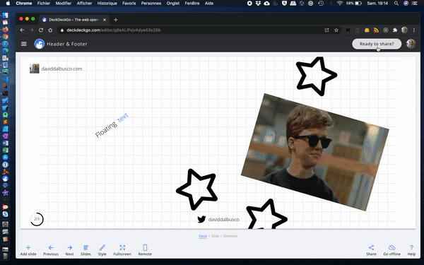
For example, we had to find a solution to display options without hiding all the content when our users were editing their slides. Even though we could have developed a custom popup for such purpose, we thought that reusing the Ionic popover would be nice. I mean, look at that sweat animation triggered on opening 🤩.
As in previous chapter about the modal, I am assuming that we might want to only apply this effect on specific popovers of our application, that’s why we are again going to use a CSS style class. Moreover, we also want to explicitly use the mode md to give the popover a “flat” style and avoid the display of a backdrop. This last point is not mandatory but make sense if you want your user to be still able to see clearly what’s next to the “popover menu”.
Angular:
async presentPopover() {
  const popover = await this.popoverController.create({
    component: PopoverPage,
    cssClass: 'menu',
    mode: 'md',
    showBackdrop: false
  });
  await popover.present();
}
Stencil:
async presentPopover() {
  const popover = await popoverController.create({
    component: 'app-page-popover',
    cssClass: 'menu',
    mode: 'md',
    showBackdrop: false
  });
  await popover.present();
}
React:
<IonPopover isOpen={showPopover} cssClass="menu" mode="md" showBackdrop={false}>
    <PagePopover></PagePopover>
</IonPopover>
Vue:
<script>
import Popover from './popover.vue'

export default {
  methods: {
    openPopover() {
      return this.$ionic.popoverController
        .create({
          component: Popover,
          cssClass: 'menu',
          mode: 'md',
          showBackdrop: true
        })
        .then(m => m.present())
    },
  },
}
</script>
We define the style on the root level of the application because the ion-popover elements are added as direct children of the main ion-app element.
We set a width, for example 540px, and a maximal value because we want to fit smaller devices too.
ion-popover.menu {
    --width: 540px;
    --max-width: 100%;
}
Thanks to this definition, we were able to change the width of the popover, but we not yet able to set the correct position, the right side of the screen, and specify a height which covers the all window.
Even though we are going to achieve our goal, I have to say that unfortunately, it is only possible with the help of the infamous !important selector. I opened a feature request about it a while ago and it is one of these suggestions which is so rarely used, that the solution should come from the community, what makes sense to my eyes. Unfortunately too, I did not have time yet to provide a pull request, maybe someday.
Meanwhile, let’s use the following style. First of all, we set the popover to the top right and we also transform its origin to match that position too. Moreover, we set a default height to 100% to match the screen and add a bit of strictly styling as defining a background and a light box-shadow.
ion-popover.menu div.popover-content {
    top: 0 !important;
    left: inherit !important;
    right: 0;

    transform-origin: right top !important;

    --min-height: 100%;

    background: white;

    box-shadow: -8px 0 16px rgba(0, 0, 0, 0.12);
    border-radius: 0;
}
That’s it, our popover can act as a menu 😃.
Conclusion
Give a try to DeckDeckGo for your next presentation and if you are up to improve these styles or have any other suggestion, please do collaborate to our project in GitHub, we are welcoming any contributions and idea.
To infinity and beyond!
David